Watershed
Year 2025
My role UX, UI, Accessibility
See live WIP
Context
Stichting Watershed asked for an outspoken, but accessible website for their literature platform. For this, we needed to keep 3 personas in mind: the experienced culture stakeholder, the ambitious talent, and the culture visitor. The website needed to be accessible specifically for neurodivergent people and their queer target audience. To the right you see where the website was when I was.
UX Research
We researched many cultural organisations (because, let’s face it, literature platforms tend to be everything but outspoken) to understand what types of content there are, how they are structured, and how the personas would move along each website. We also researched how they implemented accessibility tools.
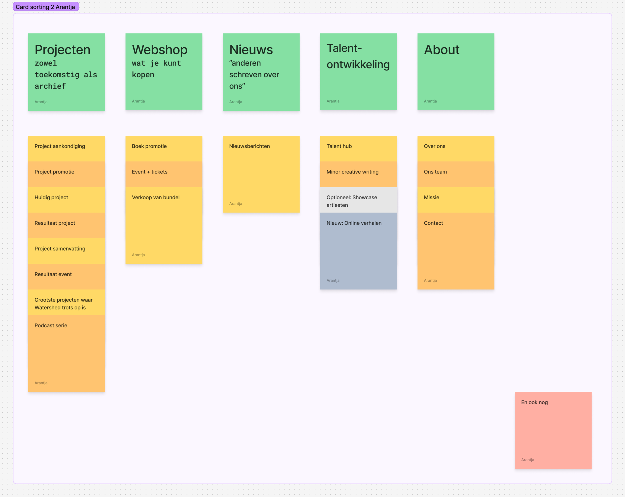
Sitemap
First of all, reordered the content to suit the 3 personas. The original website tried to do this, but a lot of content got lost; for example, who would look at the page “and also”, and was it even relevant? We did this by researching competitors, understanding how they ordered content, and understanding what our target audience and client would like.
Style
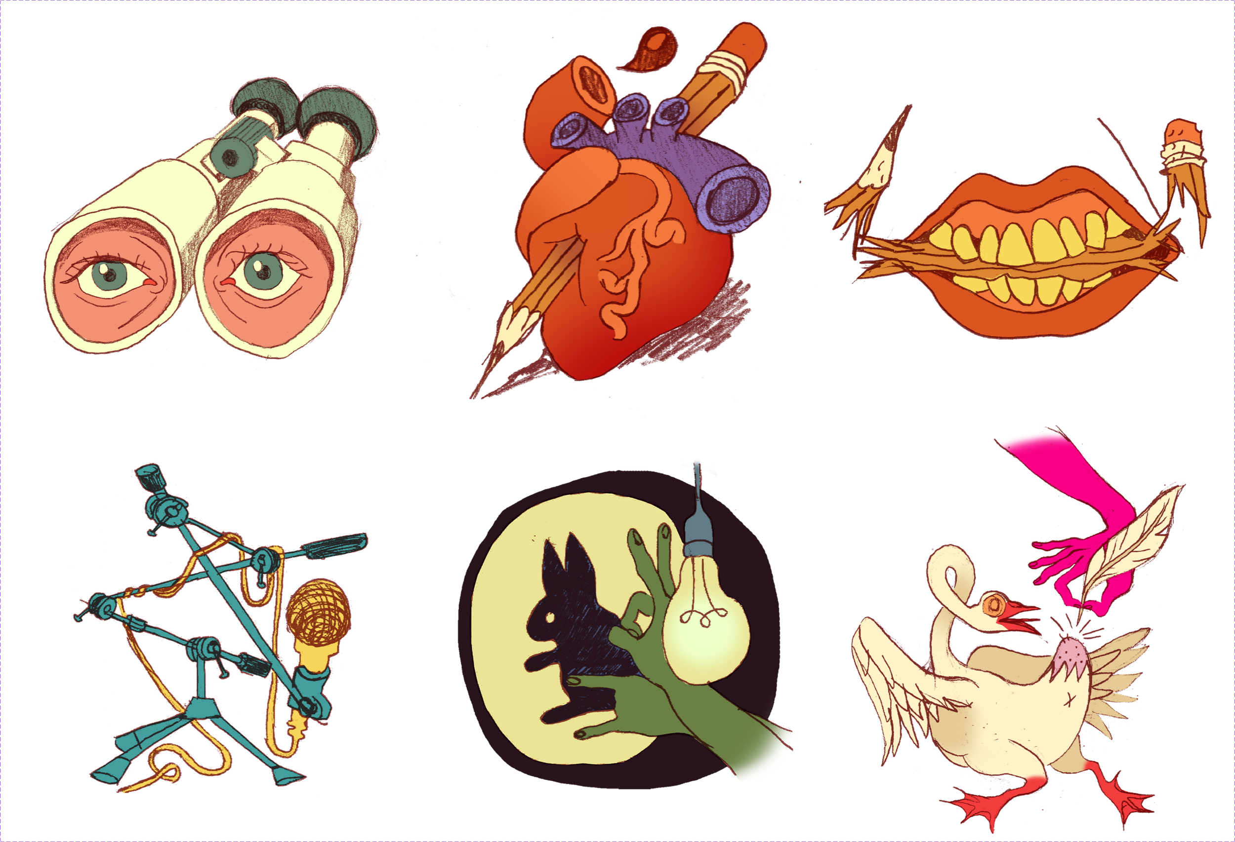
Then we moved to the UI. Watershed was already working with a marketing expert and illustrator. Together, they provided some guidelines for us: typography, illustrations, graphics, and color ideas. We challenged those ideas and made them more accessible (think high contrast, large fonts, etc.) and came to a color combo and font decision. They continued to work with the illustrator to create new illustrations and graphics for the website and are working with a copywriter to rewrite all copy from the designs.
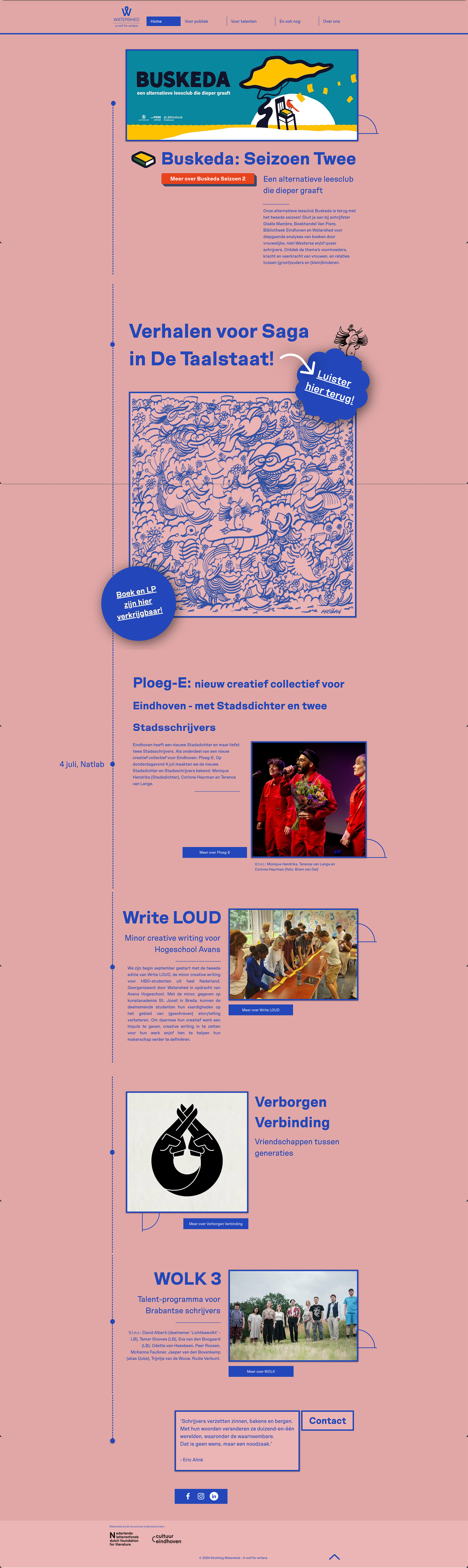
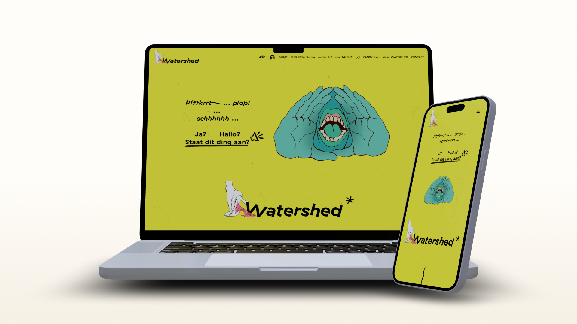
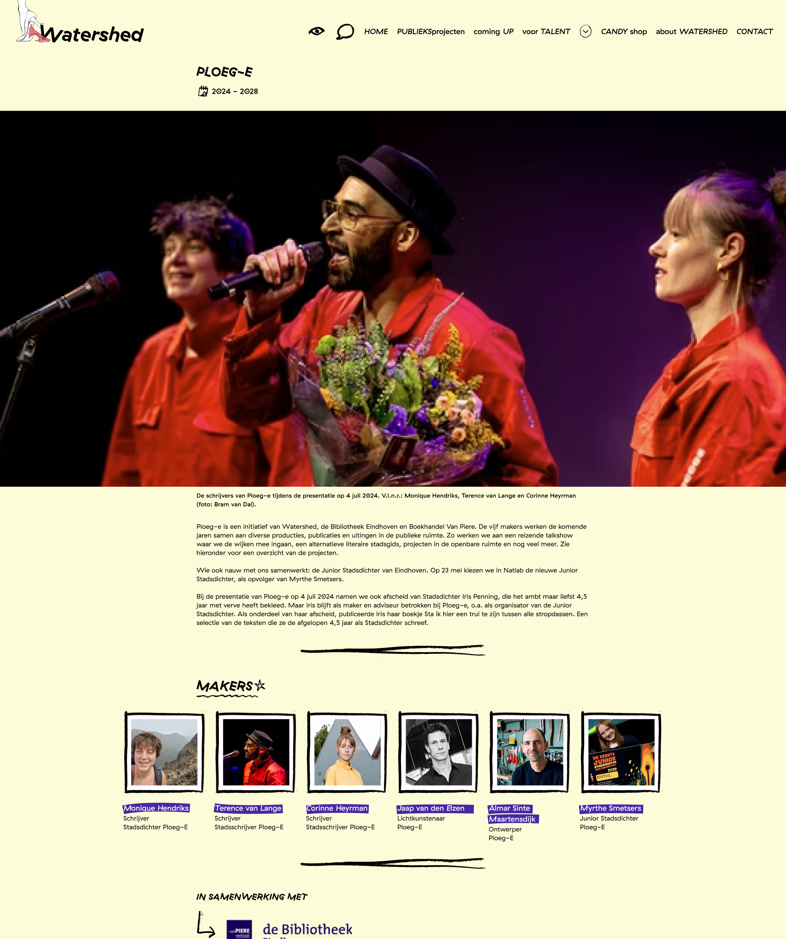
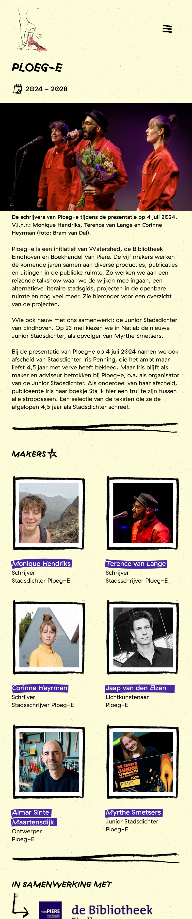
Watershed website screenshot May 2024
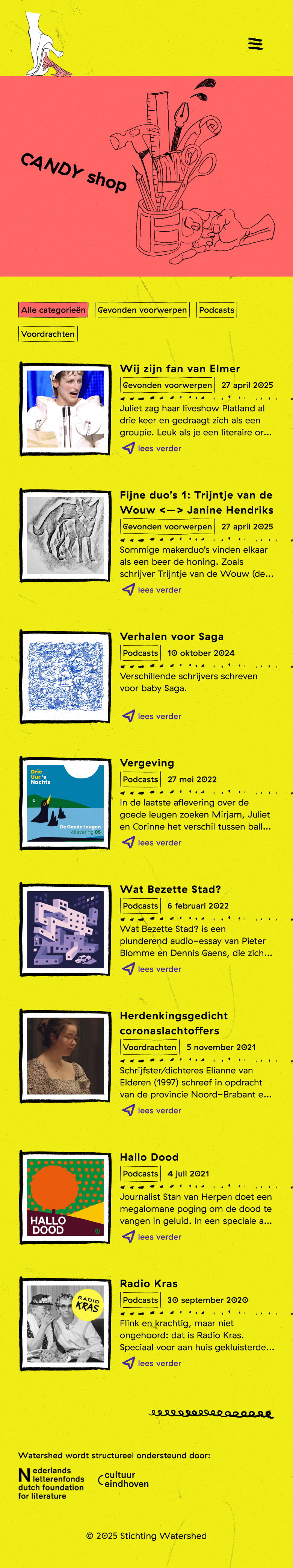
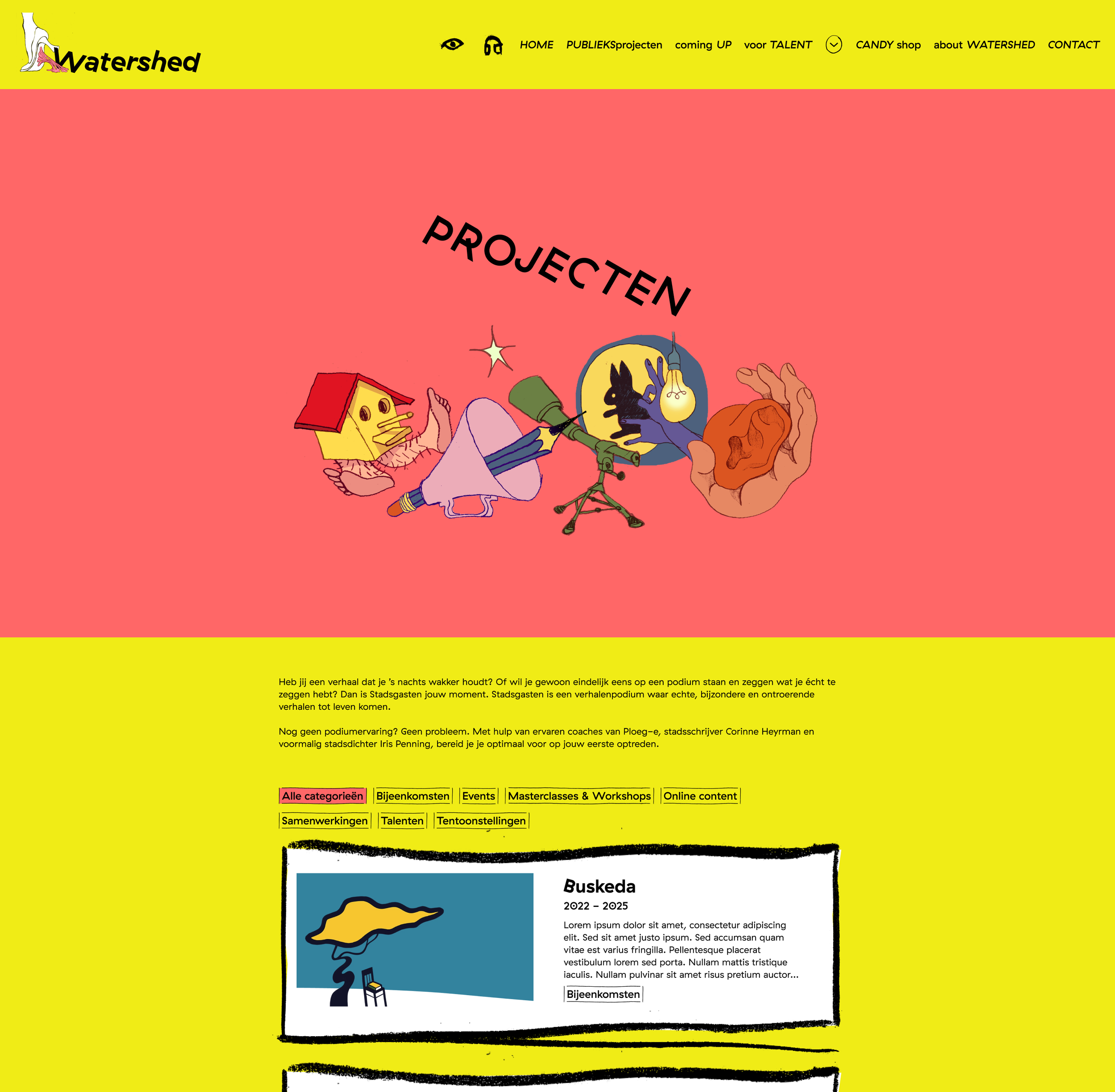
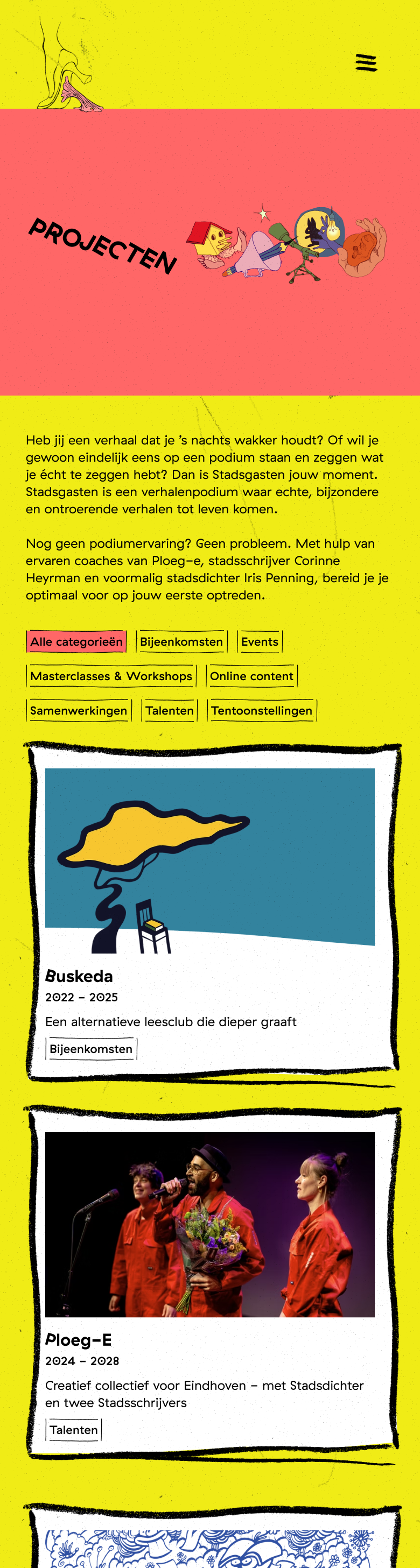
The results
Home screen sets the expectations for the user: outspoken, bright, raw. In the main menu, each persona can find what they need, or browse around and discover interesting content. Easter eggs are hidden behind the icons throughout the home page.

Specifically for the digital generation, we have collected all digital content in one place. An easy way to get to know the organisation before the culture visitor decides to buy a ticket for an event, or a place for the ambitious talent to be inspired.
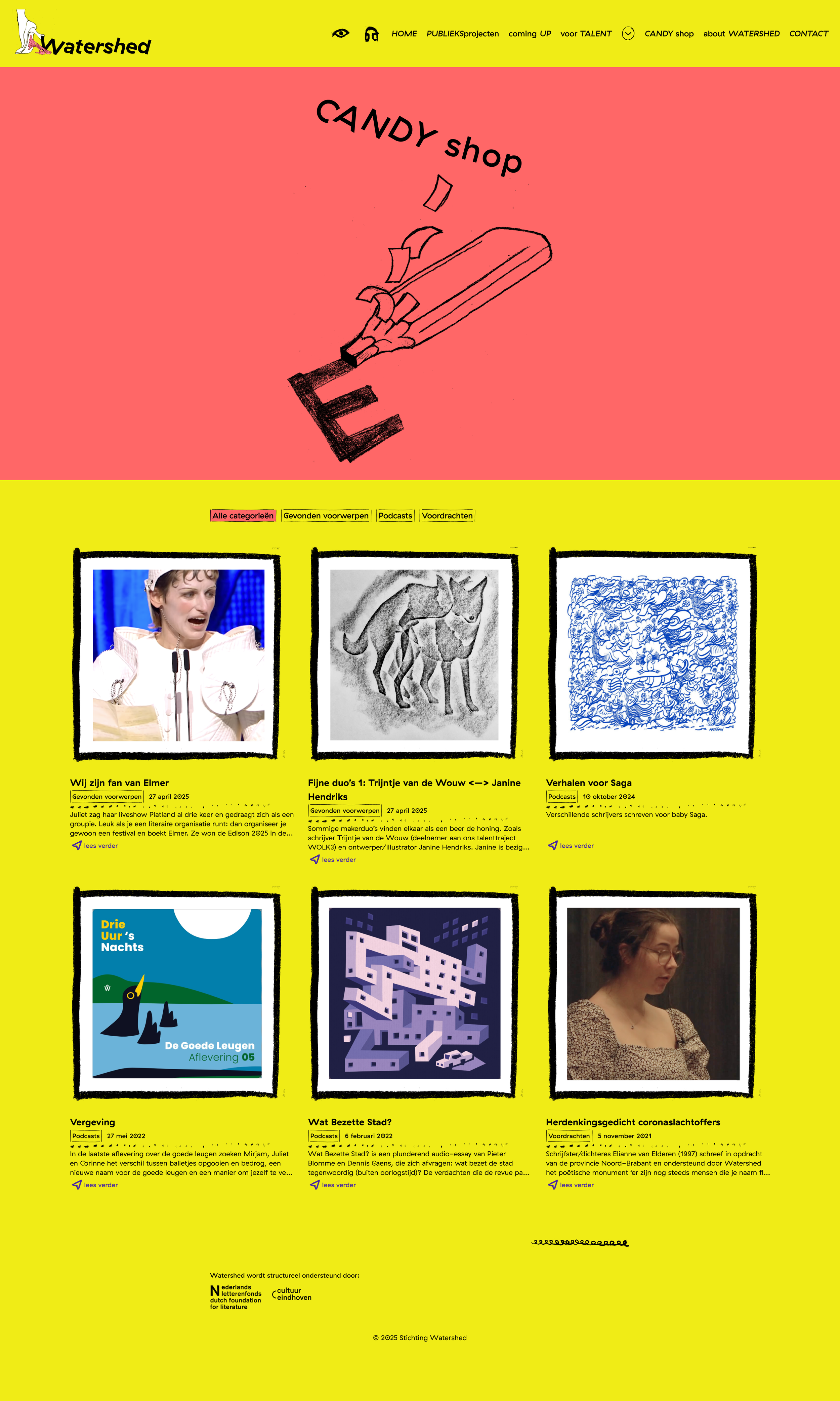
Culture stakeholders quickly want to see what they are possibly investing in, which they can do here. And there’s no doubt about it, every part on this website exclaims that this is not a regular literature foundation!
Accessibility
It’s not easy to visualise accessibility. Outside of good contrast (7:1 contrast ratio for normal text), a lot happens behind the scenes. Together, we have decided that we do want to use some automated animation in the website to draw attention to the easter eggs. To make this more accessible, we ensure that the user knows they have the option to turn all animations off immediately. Together with the developer, we are also ensuring that assistive technology in the browser and connected by the user will work on every aspect of the website. A few of the most relevant ones during this project:
Coding has been performed in semantic HTML
Font sizes can be adjusted by the browser
Components have interactive states and can be focused by assistive technology.
Videos don’t automatically start playing